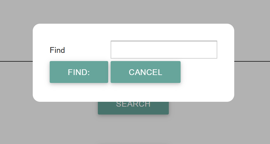
A “standard” modal Dialog box, the existing page will be grey, as shown below
Note:
- modal: means that the user can only interact with the dialog box, which must be dismissed to re-interact with the original page,
- Exact style will depend on the prevailing CSS (cascading style sheet) styles applied.
Control options are as follows (case insensitive):
- Button
- A standard button, with a required actions attached (Action Graph actions),
- Buttons
- A line containing the specified buttons,
- Combobox
- A standard Combobox, the name value specifies the variable values to be loaded, Select Action etc. can be specified etc.
- File Uploader
- A file uploaded area, where the user can specify a file to be uploaded,
- Label
- A Text Label (same as Text),
- Listbox
- A standard Listbox,
- Style
- Sets the CSS style class of any item its attached to
- Text
- A Text Label (same as Label),
- Textbox
- An standard Input textbox,
- Textbox Line
- A input textbox (see above) with the variable name preceding the field (the Find in the example),
- Display Line
- A name and variable value, this can be considered as similar to Textbox Line where the textbox cannot be altered / interacted with,
- Variable
- The value of the named variable.
Any textual string value in the Dialog node will be used as the caption for the dialog (in this example its blank), the Dialog may be dragged / move on screen by clicking and dragging the caption (or the area where the caption would be i.e. the top line of the dialog).
The graph for the above example is thus:
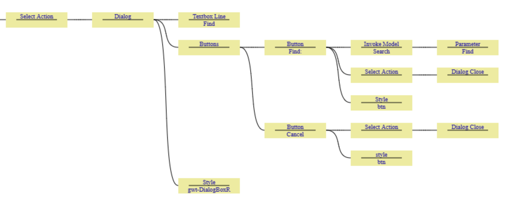
Explanation of the above example Action Graph:
- The Select Action of the preceding button (in the case the Search button on the main screen), invokes a Dialog
- The first row of the dialog contains a Textbox Line of the variable "Find"
- This will show the name “Find” followed by an Input field for the variable Find
- The second row of the dialog will contain two buttons
- The first button has the description of “Find”,
- When pressed it will invoke the users model called “Search” passing through the Parameter of the value of “Find” (the contents of the input box).
- It will then close the dialog
- The second button has the word “Cancel” on it
- When pressed it will just close the dialog (returning the user to the underlying page)
- The CSS style “gwt-DialogBoxR” will be applied to the whole dialog box, which each button having the style of "btn" applied to them (alternatively this could have been added to the wider dialog style, but was done this was the btn style is used elsewhere and therefore the approach here reduces duplication of style lines in the CSS).
- The first button has the description of “Find”,
Note on input focus:
- Keyboard focus will automatically be set to the first control (that will accept focus) in the dialog, pressing the tab key will automatically move the focus to the next control, in the order that they where defined in the action graph.
Closing Action
- Sending an Action of Dialog Close will close the currently active dialog box