The Data Grid allows find control over how data is shown with embedded buttons, icons etc.
An example would be something like the following:
The name value below the root control type (Data Grid) specifies the variable name where data will be read to. The control is a dynamic control, in that updating the variable value behind the scenes will refresh the display.
A Data Grid control with just a name is a valid instance, in this case the control will try and work out all the columns and display them as text entries, with no sort control, in the order that it finds them (usually the order of the first data entry or tuple).
Usually however, you will want to control the order and format of the columns in much more detail, as set out below, the value of the node specifies the value name to be used for that column:
- Button - Select Action is then attached to this, named Parameters will be taken from the current row of data.
- Column - Defines a text column, all text columns are sortable by clicking on the header name.
- Input - An input field, this will update the data in the underlying data structure.
- Combo - A standard Combobox, this will update the data in the underlying data structure,
- To specify the options to be in the list add a OptionsList element, then add the options to that
- When selected any Select Action associated with the control will be run
- Checkbox - A standard Checkbox
- The Name to use for the checkbox's state is the value of the node.
- When the state is changed, the data value in the stored graph will be updated appropriately.
- Value are Yes (or starts with a Y, or Y on own), anything else will result in the item being unchecked.
- Icon - The value defines the URL of the icon to be displayed.
- A child of Hover will display any text for the browser display when the mouse is moved over the icon.
- Image - The value defined in the data is the Url of the image to show. Any Hover node attached to the item in the data will be used as the image title (what is displayed when the users cursor hovers over the image).
- Info - Creates an Info Icon element, if the value defined is blank in that row data the icon will not be displayed, otherwise it will, and the value will be used as hover text unless a Hover value defines something else (which may also be blank).
Attached to each of these can be either of the following:
- Name - sets the name of the column, by default a Column type will use the variable name, others will be blank.
- Conditional - defines a condition to be met for the display of an Icon type, or item of text, comparison is done against the value of the node named in the value of this node.
- Supported comparisons are “=” (equals), “!=" (not equals), “>” (greater than) or “<” (less than)
- Style - defines a style name to be applied to that row, this needs to be created in the CSS file. Note: inline CSS is not supported.
- Format - Only the following formats are current supported:
- Date (note delimiter is the “pipe” characters)
- Date | <format from> | <format to>
- Currency
- $Currency
- Formats to ###,###,###.00
- (So always puts in two decimal places and puts in 1000's separator of a comma)
- $Currency
- Date (note delimiter is the “pipe” characters)
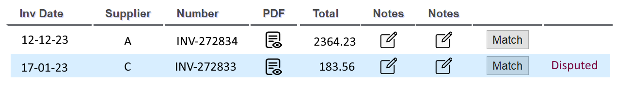
A full example is shown below:
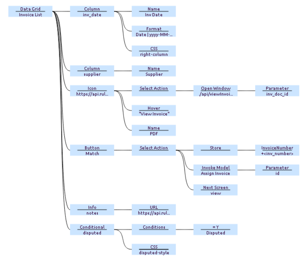
The above can be explained as for each row showing:
- A text column for the value "inv_date" with a column name of "Inv Data". The format of the date will be converted before display, and the CSS will be applied (in this case right aligning the values)
- A text column for the value “supplier” with a column name of “Supplier”
- An Icon, the URL of what to display being in the value, when clocked upon, a new window will be opened for the URL defined and passing the parameter of “inv_doc_id” from the row. The column heading is PDF. In this particular case the new window opens and displays the pdf of the invoice.
- A Button displaying the word “Match”, when clicked, the current "inv_number" will be stored and the model “Assign Invoice” will be invoked passing the Parameter of “id” from the current line. Once invoked the screen will move to the “view" screen.
- An Info Icon for the data item “notes”, when a “notes” value is present in that data row the icon will be displayed.
- A conditional display value - when the condition is met, in this case the value of “disputed” is “Y”, the value of “Disputed” will be displayed, otherwise will be left blank. The CSS style of “disputed-style” will be applied, which in this case was to display it in red.
¶ Data
It is valid to have data items in a row which are not defined in the table (and as long the default, no columns layout is not trigger, will not be displayed). This is useful where ID's are required for processing, for example when a button is pressed, but you may not want this to be visible to the user.
It is also valid to have “missing” data values in a row, however be careful of conditional statements and formatting.
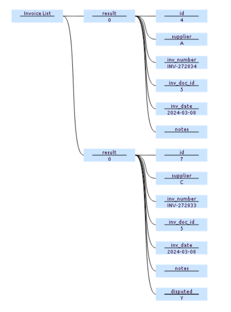
Data supplied to the control should be in the following format:
<root (data item name)>
- <row (name & value ignored for processing, but value should be unique>
- <name/values>
For example:
¶ Action when item selected:
A Select Action node may be attached to the root Data Grid node, if so when a row is clicked on the actions attached to the Select Action will be processed. If a Invoke Model is used then a Parameter of selectedItemData will pass though the graph segment of data for the selected item.
¶ Note:
- This is one of the more powerful controls, as such there can be significant complexity in setting it up, it is highly recommend to start simple, with a cut down version, then build up the complexity in steps.
- Button
- May also have a Debounce node (its name) added, with a value (which represents milliseconds). When pressed, a button with this property, will disable itself from being pressed / activated again for the specified number of milliseconds (which must be more than zero), generally a value of 5000 or so (5 seconds) is useful. After the specified period the button will re-enable itself. Thus the button cannot be accidentally pressed multiple times (and is thus debounce'ed).
- Input
- When a value is changed the value in the input graph structure will be changed accordingly, therefore this same structure may be returned to another model for processing (e.g. storing)
- The style of any input field is set to grid-input-style this allows a min-width to be set (in the page CSS), otherwise if the field is empty the browser is likely to shrink the field to a size which is almost impossible to see or click on.
¶ Hints & Tips:
- If the DataGrid is always showing the loading bar, then no data has been loaded, returning an empty set of data / loading the variable with an empty dataset (no children), is valid and will cause the loading bar to disappear.
- To hide the title bar, first set all the column names to blank (with blank Name nodes), then hide the horizontal rule with the following CSS: .AKQ5O4-a-h { border-bottom: 0px !important; }
- CSS may be applied at either a grid or cell level via the template.