Defines a standard checkbox control.
The name of the control specifies the name of the associated variable. By default this name is used as the text next to the control, however this text can be replaced by attaching a Label node to the Checkbox node. Any label text (even if blank) will be used as the text rather than that of the controls name.
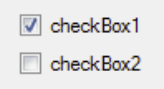
A variable of <name> can be set to True or False, and the checkbox will start in that state. The state is dynamic, i.e. if the variable value is changed, perhaps via a Store action of a invoked model (see action graph) then the value on screen will change.
If the user interacts with the control the variable will change, so it can be picked up and used as a Parameter for a model invocation.
Specific styling may be achieved by the use of CSS.